Google has done it again. The technology giant, which is feared as the company that is transforming the digital environment, subtly but with an air of confidence, has released an all new logo in the year 2025. On face value, the alteration may not appear to be a major one, however, it represents some subtle, sublimated affirmations about the direction the company is taking, its user experience priorities and the increasingly shifting sands of digital design.
Here, we take a deep dive into Google’s most recent logo overhaul: what’s different, the reasons behind the changes, how consumers have responded and the implications for the future of branding in the digital era.
A Brief History of Google’s Logos
And some context before we delve into the 2025 update. Google’s logo, meanwhile, has changed a few times since the company was founded in 1998. Here’s a quick timeline:
- 1998: The original Google logo was designed using free graphics software called GIMP and was simply the company name written out in a bland looking font — and a Yahoo!isque exclamation point.
- 1999–2010: A higher-quality serif font and drop shadow made Google look three-dimensional.
- 2010–2013: Small adjustments modernized the logo by cutting out the heavy shadow and lightening the shades.
- 2015: A major shift happened. A modern geometric typeface in product sans was created and applied at google. It was minimalist, flat and mobile-friendly.
- 2025: This latest alteration to the logo, then, draws on that heritage to indicate a new era for the company.
What Changed in the 2025 Logo?
None of this might sound terribly dramatic at a first read, but as it so often is with design evolutions, the devil is in the details. Here are the most important changes:
1. Font Refinement: Google Sans Rounded
Google has now switched from Product Sans and adapted it to their own version called Google Sans Rounded. The new typeface retains the geometric simplicity of the 2015 logo, but with minor curves and softened terminals, adding a friendlier, more human quality to the wordmark.
2. Color Palette Tweaks
Google’s traditional 4-color theme is still in use (b: blue; r: red; y: yellow; g: green), but now they’ve been slightly altered to pop a bit better and to look consistent across screens. Blues and Greens are now a little deeper, while Reds and Yellows are a bit more vibrant — all while still maintaining full visibility when using at night time or on OLED/HDR displays.
3. Letter Spacing and Kerning
Google has adjusted the spacing between letters, particularly between the ‘o’s and the ‘g’. The snugger kerning makes for a less sprawling logo that can adapt to display on anything from smartwatches to TVs.
4. Motion Logo for Interactive Use
But the most fun new thing might be a motion version of the logo that has a steady, gentle animation when you’re waiting for something to load in a Google app or product. The letters will “appear” with a bounce, and the colors change dynamically to represent, say, active input or voice interaction.
Why Did Google Change Its Logo?
While this may have all been part of the plan, the design team at Google always had a philosophy of “evolution, not revolution.” The new logo serves several strategic objectives:
1. Consistency Across Devices
With Google nestled in everything from Android Auto to Google Home displays and smartwatches, the new logo is designed to be more clearly visible and legible across the spectrum of ultra-small to ultra-large displays.
2. Human-Centered Design
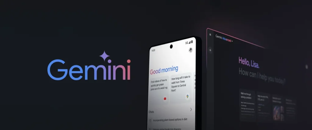
The rounded corners and softer colors on the logo provide a more approachable feel, echoing Google’s mission to increasingly focus on AI with empathy and more conversational UIs. As Google Assistant and Gemini gained recognition in the home, the visual language needed to be equally warm and approachable.
3. Brand Refresh Amidst New Offerings
2025 has been a busy year for Google, with AI coming to Search, Gemini 3.5 for Workspace, and a broader Pixel Fold lineup.
Public and Industry Reactions
Design Community
Designers have largely embraced the change. High-profile UX designers commended Google for being true to itself yet updating the brand just enough to be contemporary.
“Google’s new logo feels like a mature upgrade without losing their cute touch. It’s the paradoxical intersection of corporate design and emotional intelligence,” said Sarah Langley, a senior designer at Pentagram.
General Public
Responses on social media have been rather mixed, but mostly positive. Some people didn’t even realize it had changed until they were told, but others liked the setting for its cleaner — and more animated — look.
“I thought I was seeing things. Then I realized Google’s logo is actually kind of different—but I love it,” wrote @TechWhizMax on Twitter.
Brand Analysts
Branding experts say the update is a sign of Google’s confidence and stability. “They don’t have to rebrand dramatically because they have a strong identity,” said Emily Robertson, VP of Brand Strategy at Interbrand. “This is evolution, it’s not out of desperation.”
What This Means for Google’s Brand
The new logo says a lot about Google’s brand in 2025, without saying much at all:
- Confidence: This is not a company to follow trends. It’s honing a visual identity that is already one of the most visible in the world.
- Humanization: Its design is in line with its increasing focus on AI with a personality (hello, Google Assistant and Gemini).
- Future-readiness: Ready-made for flexible, digital-first design that can open to fit everything.
Comparison: Google vs. Other Tech Giants
First let’s put this update in the context of recent branding trends:
| Company | Last Major Logo Change | Trend |
|---|---|---|
| Apple | 2017 (flat monochrome) | Minimalism |
| Microsoft | 2012 (Metro UI) | Modern grid + color blocks |
| Meta (Facebook) | 2021 | Full rebrand for the metaverse |
| Amazon | 2023 (refreshed smile logo) | Subtle UX-friendly change |
| 2025 | Softened geometry and animated interactivity |
In its class, Google still manages to blend approachability with provocation, pioneering interactive brand personality.
The Role of Logos in a Post-Static World
One of my favourite aspects of the Google logo in 2025 is the progression towards motion and interactivity. At a time where static content is diminishing, dynamic branding is crucial.
Why Motion Matters:
- Mobile primed to focus attention.
- It improves the visit ability with a visual cue to the actions.
- Communicates mood and responsiveness — especially in the context of voice and AI interactions.
Anticipate other tech brands to promptly follow by integrating micro-animations and contextual branding into their interfaces.
Behind the Scenes: The Designers of Change
Although Google has not shared a detailed breakdown of the redesign process, sources say the update was created by Google’s in-house Material Design team, in conjunction with a new cross-functional project named “Project Streamline.”
The design brief was said to concentrate on four key objectives:
- Readability in different resolutions and languages
- Welcoming, non-threatening graphics
- Support for motion and voice detection
- Consistent, world-wide across 200+ markets.
FAQs About the New Google Logo
Is the Google “G” icon changing too?
Yes. The one-letter “G” favicon and mobile app icons have also been updated to reflect the rounded style and slight color modifications of the full logo.
Will the Doodles still look the same?
Google Doodles for ever and ever! But the canvas for Doodles will now honor the spacing and font metrics of the new logo, so that art and brand blend more seamlessly.
Is this logo permanent?
Nothing is ever permanent in digital design, but expect this logo to last a few years. We know Google basically redesign their look 5–10 years apart.
Final Thoughts
The 2025 Google logo may seem like a small tweak to some, but to observers of digital branding, it represents a much deeper evolution in how one of the world’s most dominant companies presents itself to billions of people.
And this update is not just cosmetic. It’s also about future-proofing, humanizing and mobilizing the Google brand more broadly, for a world more influenced by AI, interactivity and screen diversity than ever before.
So the next time you write “google. com” and notice that familiar (but ever so slightly different) wordmark, remember: every pixel has a purpose.
Disclaimer: Information provided is based on publicly available sources and user experiences.
if you have any issue with this Article – Click Here